Thank you to Folk Art for today's Laundry Room Sign Tutorial and giveaway. This post contains affiliate links. I make a small percentage when these links are used, at no additional cost to you.
This Milk Paint Laundry Room Sign Tutorial is a great step-by-step for using this fun and versatile paint. I made two signs to complete a wall in our laundry area. AND, I'm teaming up with Folk Art to give away $150 worth of milk paint in this post.
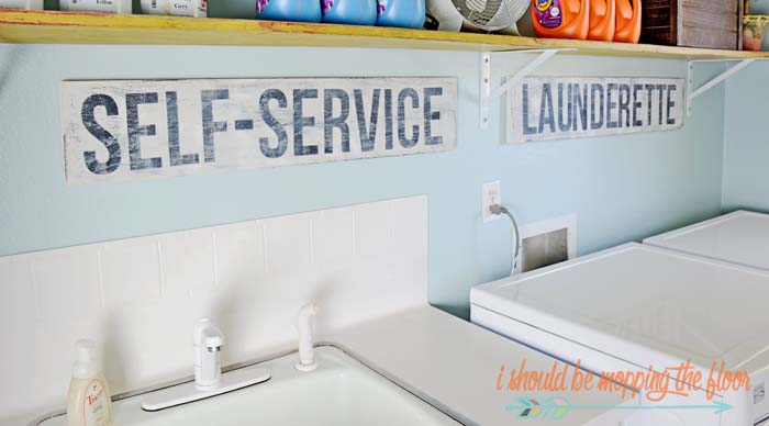
The laundry space in our "lauffice" is really coming together. I wanted a couple of vintage-looking signs under my shelves. Since I had a super specific size I needed, I thought it would be fun to make these myself. I have the step-by-step tutorial below, in case you want to make some fun milk paint signs, too.
Laundry Room Sign
Self-service launderette...I wish that were true. Seems like this is a drop & go establishment these days. ;) But, I needed a bit of humor to make that fun task of laundry a bit more enjoyable...vintage-looking signs to the rescue, y'all! And these were very simple to make, too.
I used Folk Art's line of Milk Paint (available here on Amazon) to create these signs.
Please note: the milk paint giveaway has ended.
I love the fun, crackly, aged look this produced.
Don't they look great? I'm really happy with how they turned out.
Be sure to enter to win your own Folk Art Milk Paint below.
I'm kind of a paint snob...but I'm super loving the Milk Paint from Folk Art.
So much so that I've teamed up with them to give away $150 worth of it to one reader.
GIVEAWAY IS NOW CLOSED.
Signs like this are somewhat created in reverse...I first used the color my letters would be for the "base". This is Pirate Black from Folk Art's Milk Paint line. You can find the entire line of Folk Art Milk Paint here on Amazon.
Creating a Milk Paint Sign:
After my first layer of paint was dry, I laid down vinyl lettering for my sign (I cut mine from my machine, but you can grab pre-cut vinyl letters at the craft store). I then went over my vinyl with one more coat of the black...to "seal" my letters down. The font I used here is called Bebas Neue.
I used a Miss Mustard Seed's Wax Puck all over the piece once it was dry. You can use a candlestick for this, too. It makes the piece easier to age...the next layer of paint won't stick as well to the areas with wax on them. It creates a great, aged look.
I then went over the whole piece with the Milky White color. I love Folk Art's Milk Paint because of two main reasons...1)the coverage is amazing and 2)it's premixed, unlike some milk paints. I think the bottles are super cute, too. ;)
I pulled off my vinyl letters and used my sander to rough the sign up and pull off a little of that Milky White paint. After wiping the signs down, I went over them with the finishing oil on a soft cloth. This protects them as well as deepens their finish.
I love the fun, crackly, aged look this produced.
Don't they look great? I'm really happy with how they turned out.
Be sure to enter to win your own Folk Art Milk Paint below.
I'm kind of a paint snob...but I'm super loving the Milk Paint from Folk Art.
So much so that I've teamed up with them to give away $150 worth of it to one reader.
GIVEAWAY IS NOW CLOSED.


Bristol green
ReplyDeleteCOVERED BRIDGE!
ReplyDeleteCOVERED BRIDGE!
ReplyDeletePirate black would be the one constant color I'd use with all others!
ReplyDeleteMonument Gray! <3
ReplyDeleteI love the Cottage Green!!
ReplyDeleteI love the blue belle color.
ReplyDeleteI love the blue belle color.
ReplyDeleteI love New England Red!
ReplyDeleteThis is tough!! I have projects on the brain, so either the Pink Dogwood for a furniture rehab or the Absinthe for a vintage chalkboard project!
ReplyDeleteBlue Belle (duh) �� I do however think the pale peach and harbor would be adorbs on a fun spring/summer project
ReplyDeleteOooooohhh I just tried this paint for my hubby's Father's Day present. The kids and I used cottage green and I LOVE it!! I'd love some paint to make more signs for our new home! :-)
ReplyDeleteOhh Veranda Blue matches my den!!!
ReplyDeleteOhh Veranda Blue matches my den!!!
ReplyDeleteThese are just too cute! You really did a nice job. I'm wishing my laundry room was just as cute. I really like the cottage green color!
ReplyDeleteNice! My wash room isn't complete at all. I have to find a nice laundry basket and put up some shelves. This is a great addition to the room though I wonder if I can make some signs for the kids so their baskets can be under the sign. Now you have given me ideas!
ReplyDeleteI have some pieces from the thrift store that are in line to be painted next month. I am in love with Pale Peach and Petticoat! Such stunning colors, it is hard to choose a favorite! ♥
ReplyDeleteI love the blue belle!!!!!
ReplyDeleteBlue Belle and Shaker Red!! Great tutorial!!
ReplyDeleteBesides Milky White....I would have to go with Blue Belle !!!<3
ReplyDeleteHard to choose!!! Love the shaker red and milk maker blue!!!! Love to win this, awesome tutorial!
ReplyDeletecottage green
ReplyDeleteSumter Blue is color I like the best. Although to be honest there were quite afew i liked.
ReplyDeleteBlue Belle would finish off my daughters desk quite nice!
ReplyDeleteHmmm....so hard to choose just one but I finally picked Jamestown Blue!
ReplyDeleteKristi, I can see why you love these paints...so many beautiful shades! Choosing only one is impossible for me, but my two favorites are Pale Peach and Pink Dogwood. Your tutorial is wonderful, as always. My laundry room is a bit bare and could use a couple of these signs. A big Thank You to Folk Art for such a great opportunity!!❤️
ReplyDeleteI love this distressed look. Perfect for any laundry room. I do wish we had a bigger area for us to have space to really decorate our laundry area. THese turned out great.
ReplyDeleteBristol green!❤️
ReplyDeleteThis comment has been removed by the author.
ReplyDeletePlymouth rock!
ReplyDeleteLoved your tutorial. My favorite, Jamestown Blue!
ReplyDeleteI love the churned butter color
ReplyDeleteMonument gray and veranda blue
ReplyDeleteI'm totally in LOVE with these signs! I've been on a dream "Farmhouse" interior planning kick lately and I can totally see some Milk Paint farmhouse-ish signs working really well! The fun, crackly, aged look is just PERFECT!! I love all the colors but I'm really drawn to the Cottage Green!
ReplyDeleteOoh, I love your laundry space! How beautiful. And those signs -- I'm in love! I've heard a lot of people talking about Milk Paint, but wasn't exactly sure how to use it. Now I know!
ReplyDeleteThis is such a trendy idea! I would love to have a sign like this for my laundry room too!
ReplyDeleteWow! I always wanted to know how to do this! I'm going to have signs everywhere! I'm in love with Pale Peach and Churned Butter ❤
ReplyDeleteWow! I always wanted to know how to do this! I'm going to have signs everywhere! I'm in love with Pale Peach and Churned Butter ❤
ReplyDeleteMy teenage daughter is all about DIY projects. This Milk Paint laundry room sign looks like something she would absolutely love to do. I can't wait to show this to her. Thanks for sharing.
ReplyDeleteCabinet Maker's Blue. I'm already thinking of a project to try this on.
ReplyDeleteLove the sign! How I wish laundry was self serve. :)
Farmhouse Ochre
ReplyDeleteI love a lot of the colours, but Cottage Green is my fav. :)
ReplyDeleteI never tried milk paint from this company and I really like Country Squire.
ReplyDeleteOh, that milk paint looks yummy. I want to make a few of these. Thanks for the tutorial!! & tips about the wax.Thanks for sharing at the Inspiration Spotlight party. Shared.
ReplyDeleteCottage green
ReplyDeleteCottage green
ReplyDeleteCabinet Maker's Blue.
ReplyDeleteBlue belle
ReplyDeletePetticoat is my favorite although I would love to try the cottage green too.
ReplyDeleteCottage green all the way! However, couldn't you imagine a house full of these colours...talk about fresh looking.
ReplyDeleteCottage green all the way! However, couldn't you imagine a house full of these colours...talk about fresh looking.
ReplyDeletechurned butter, so cheery
ReplyDeleteI like the Blue Belle color.
ReplyDeletedlatany at gmail dot com
Very tough choice, but have to say Blue Belle because I'm from Texas. Thanks for the wonderful tutorial. Have to try this project. Folks who share their talents have a heart of gold!
ReplyDeleteI really like Blue Belle and Winter Harbour though they are all fantastic colors!
ReplyDeleteChurned Butter is perfect!!
ReplyDeleteI love the pink dogwood :)
ReplyDeleteJust did my upstairs bathroom in white and cottage green!
ReplyDeleteYour tutorial was very helpful and your signs turned out great! I really like the cabinet maker's blue!
ReplyDeleteLove Brass Buckle since I'm all about fall colors right now.
ReplyDeleteQuaker Blue and Shaker Red
ReplyDeleteCabinet Maker's Blue F/A Milk Paint is my favorite but I would use Pirate Black the most. There are sooooo many "Favorites" that it's hard to pick just one! I REALLY want to try this! I almost bought this at Joann's yesterday but I didn't have my coupons!!!! ;-)
ReplyDeleteCabinet Maker's Blue F/A Milk Paint is my favorite but I would use Pirate Black the most. There are sooooo many "Favorites" that it's hard to pick just one! I REALLY want to try this! I almost bought this at Joann's yesterday but I didn't have my coupons!!!! ;-)
ReplyDeleteChurned butter seems like a beautiful lemony color. When we moved into our new house 7 years ago we painted several of the main rooms a sunny yellow.
ReplyDeleteI love Pink Dogwood!!!
ReplyDeleteCottage Green!
ReplyDeleteHard to pick, but cottage green.
ReplyDeleteCottage Green is gorgeous!
ReplyDeleteQuaker blue, i love dark blues right now.
ReplyDeleteSo many beautiful colors but I love the Cottage Green.
ReplyDeletePirate Black would be a go to color for me. I use a lot of black when I paint.
ReplyDeleteAbsinthe
ReplyDeleteLove your signs! I also love the Lexington Blue paint color. :)
ReplyDeleteBlue Belle
ReplyDeleteOh, I really love the cottage green! Your signs are awesome! :o)
ReplyDeleteTania
I love the blue belle!
ReplyDeleteThis is so cute! <3
ReplyDeleteBlessings,
Edye | Http://gracefulcoffee.wordpress.com
They are are so beautiful and smooth looking, but since I'm beginning a reno in my kitchen and dining area and making a gallery wall, I would love to have the Churned Butter.
ReplyDeleteThanks for the opportunity!